ROLES
Lead Designer: Bradford Roberts
PROJECT DESCRIPTION
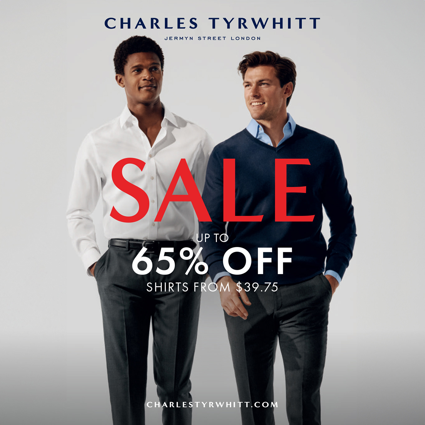
A strategic print campaign was developed to amplify Charles Tyrwhitt's in-store presence during targeted retail promotions. Through a series of thoughtfully crafted printed materials, including shelf talkers, posters, tags, hangers, or display graphics, this project elevates brand storytelling at the point of sale. It emphasizes the brand’s refined British heritage, seasonal sartorial appeal, and commitment to quality, helping to drive customer engagement and purchase decisions within a tailored retail environment.
PROGRAMS
PROGRAMS
Adobe Photoshop, Illustrator
Challenge
Charles Tyrwhitt’s retail environment demands a careful balance of premium brand presentation and clear promotional communication. The challenge was to create a cohesive suite of in-store printed materials, shelf talkers, posters, hangers, tags, and display graphics, that supported seasonal promotions without disrupting the refined British aesthetic the brand is known for. Each piece needed to work across varied store layouts, lighting conditions, and customer touchpoints, all while maintaining visual harmony and delivering messaging quickly and effectively in a busy retail setting.
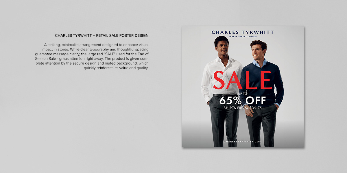
POSTER DESIGN
Insight
In-store shoppers make decisions within seconds, gravitating toward visuals that are both aspirational and easy to interpret. Research into retail behavior and Charles Tyrwhitt’s customer base revealed that subtle cues, typographic clarity, premium material finishes, and seasonal color accents, greatly influence perceived quality and purchasing confidence. By elevating promotional materials through thoughtful design, the brand could reinforce its heritage-driven sophistication while guiding customers toward seasonal collections and key product stories. The insight underscored the need for a system that communicates value without compromising luxury.
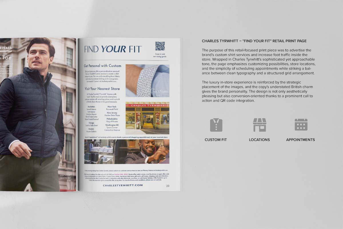
RETAIL PRINT PAGES
Execution
The campaign was crafted as a structured visual system spanning multiple print formats, ensuring consistency from rack to showcase.
Key execution elements included:
Unified Visual Language: A cohesive typographic system, refined serif-sans pairing, and premium color palette aligned with Charles Tyrwhitt’s brand identity.
Seasonal Accents: Introduced subtle visual cues, light textures, color shifts, and photography direction, to match the current promotional theme while retaining brand integrity.
Modular Layouts: Designed flexible templates for shelf talkers, posters, window graphics, and garment tags to adapt across different store configurations and product displays.
Quality Print Production: Considered finishes, scale, and print legibility to ensure clarity from close and long viewing distances.
Story-Forward Messaging: Crafted concise, on-brand copy emphasizing craftsmanship, seasonal versatility, and value.
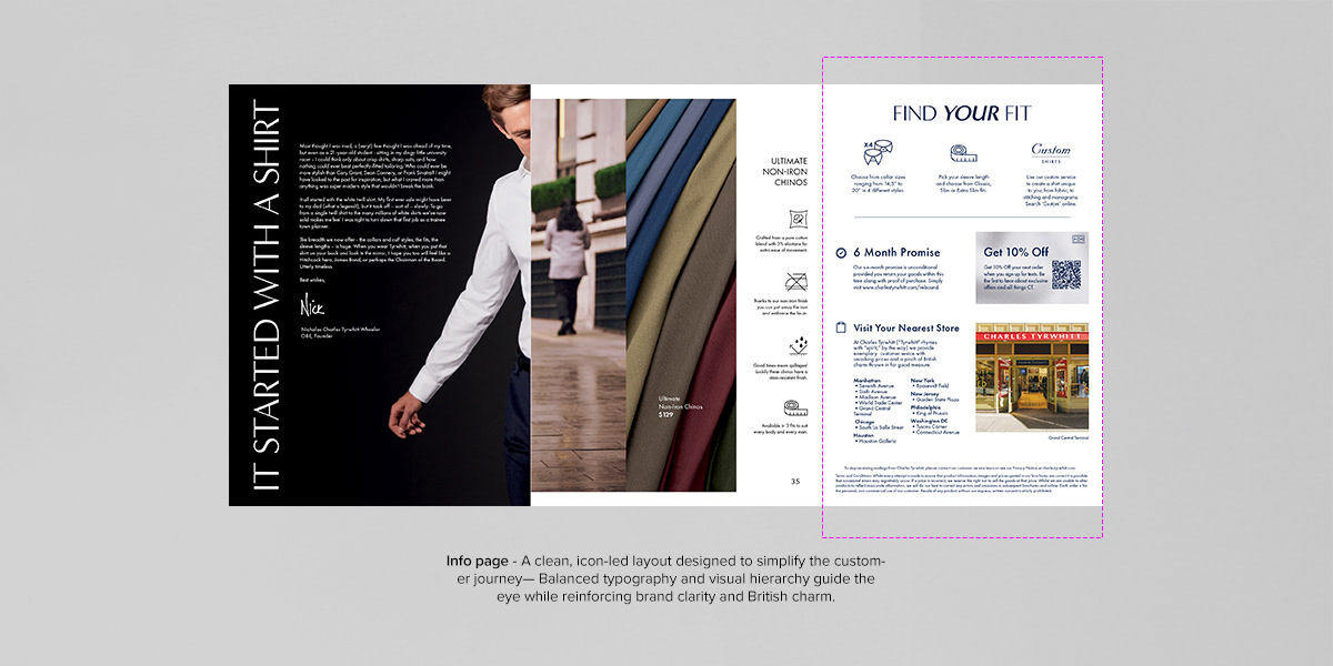
Every piece reinforced the in-store journey, guiding customers through the offer while enhancing the overall shopping experience.
Impact
The resulting campaign strengthened Charles Tyrwhitt’s retail storytelling while driving clearer customer pathways through seasonal promotions. The polished point-of-sale materials elevated brand perception, enhanced product visibility, and improved the cohesion of the in-store experience. By blending heritage-rich aesthetics with strategic communication, the campaign deepened customer engagement and supported retail conversions. As a portfolio piece, this work highlights my capability to design scalable in-store systems, elevate promotional messaging, and translate brand DNA into tangible, high-impact retail touchpoints.