ROLES
Art Director/Illustrator: Bradford Roberts
Motion Designer: Ritu Nirman
PROJECT DESCRIPTION
Motion Designer: Ritu Nirman
PROJECT DESCRIPTION
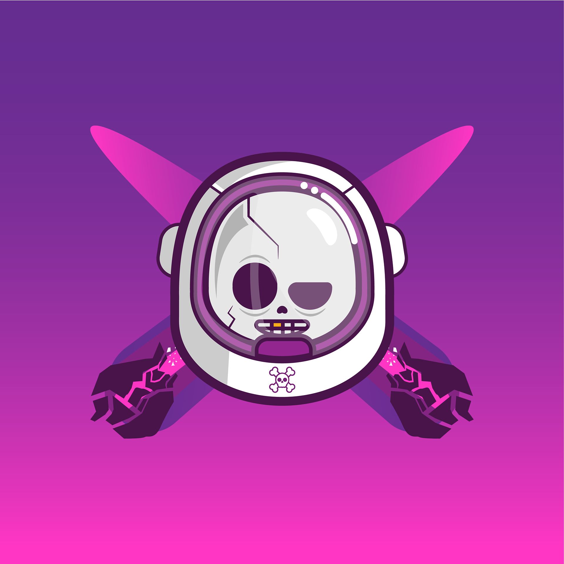
The Space Pirates logo blends rebellious energy with cosmic adventure, reimagining the classic Jolly Roger for a futuristic frontier. The mark features a skull encased in an astronaut helmet, flanked by two crossed comets streaking diagonally downward, symbolizing exploration, danger, and thrill. Designed with a bold, modern aesthetic, the logo captures the spirit of interstellar rebellion and playfulness at once.
Motion Design Collaboration
As Art Director, I guided the motion designer through the animation process to bring the identity to life. The concept was for the logo to fly into the foreground as if emerging from deep space, with the comets streaking in from opposing directions before locking into their crossed formation behind the skull. As a final touch of personality, the skull gives a wink and a grin, adding a sense of charm and attitude that reflects the brand’s playful rebellion.
TOOLS/PROGRAM
Pencil, paper, eraser, Adobe Illustrator, Adobe After Effects
Challenge
The challenge was to reinvent one of the most recognizable symbols in visual culture, the Jolly Roger, while transporting it into an entirely new genre: sci-fi adventure. The identity needed to balance rebellious pirate energy with futuristic space aesthetics without feeling cliché or overstylized. The logo also had to function across static, digital, and motion contexts, requiring a design that was bold, readable, and expressive at any scale. Additionally, as Art Director collaborating with a motion designer, it was essential to translate the brand’s thematic personality into animation that felt cinematic, cohesive, and full of character.
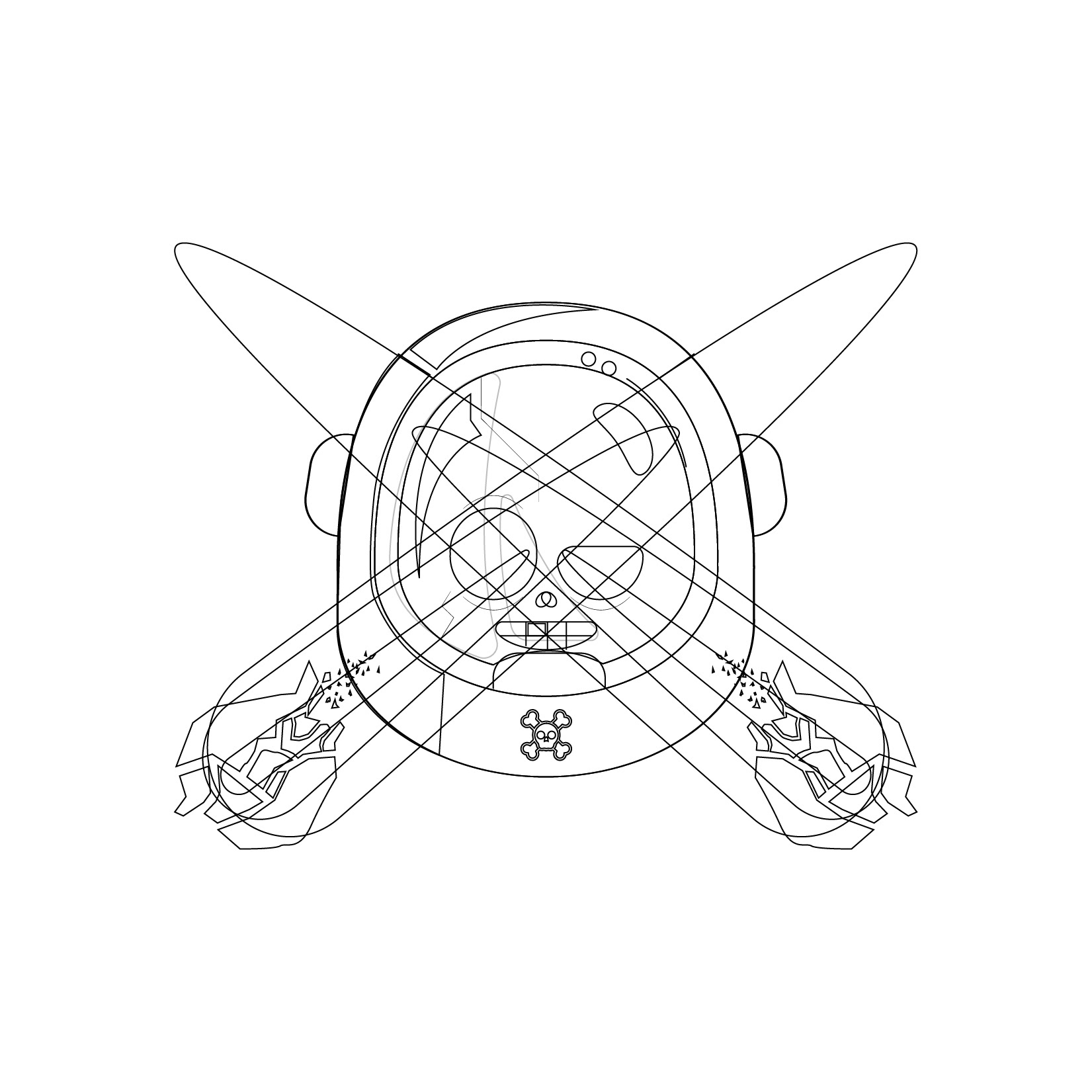
LOGO OUTLINE
Insight
Iconic marks succeed when they communicate a complete story in a single glance. Through exploration of pirate iconography, sci-fi tropes, and neon-influenced palettes, a key insight emerged: the identity needed to embrace duality, danger and humor, rebellion and charm, darkness and neon brilliance. The astronaut-skull hybrid provided the perfect narrative anchor, instantly conveying danger with a twist of playfulness. The hot pink, purple, white, and black palette evoked both cosmic mystery and electric attitude, aligning with modern “space punk” aesthetics. This insight reinforced that the logo’s power would come from the tension between familiar symbolism and unexpected reinterpretation.
LOGO REBRANDING
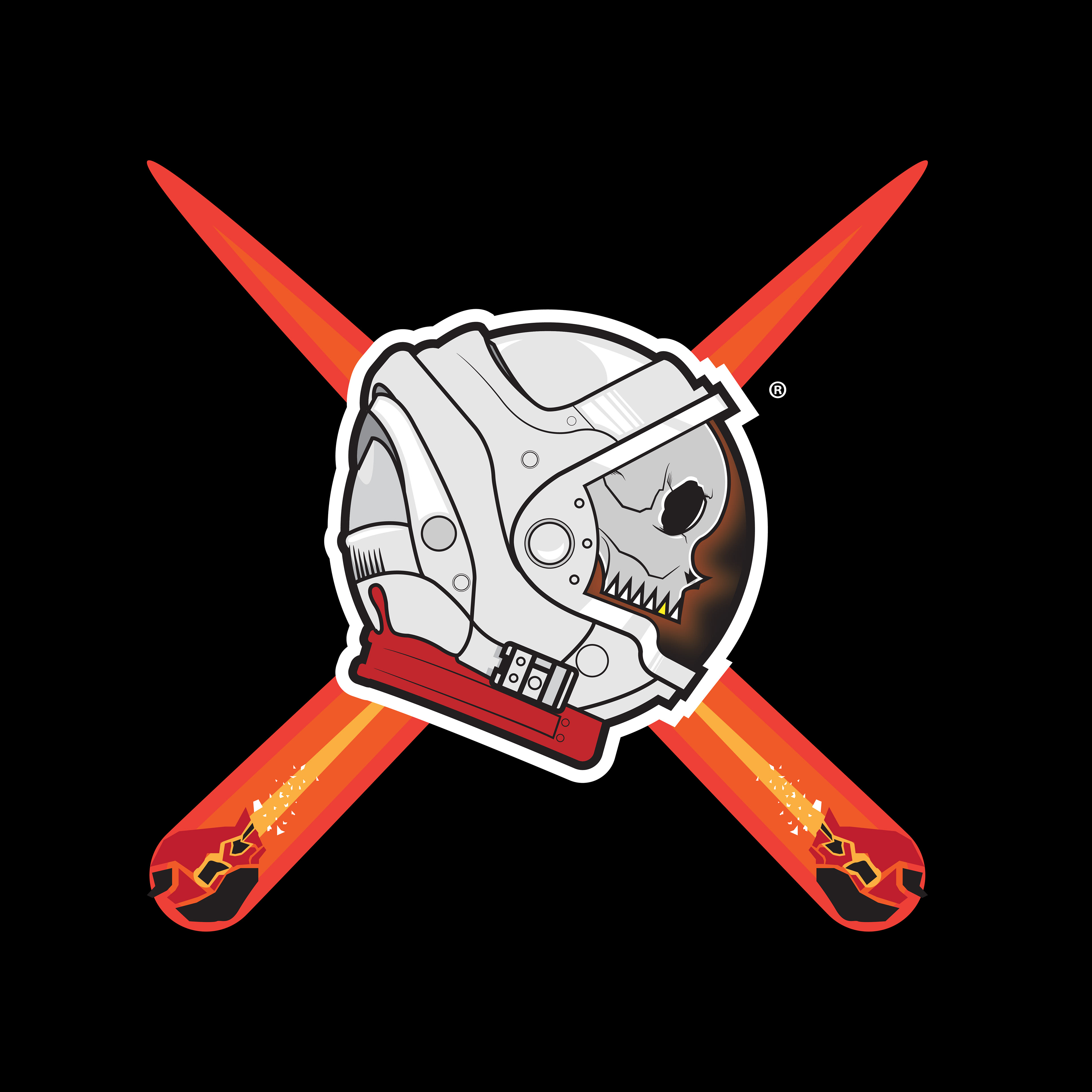
My original Logo Design
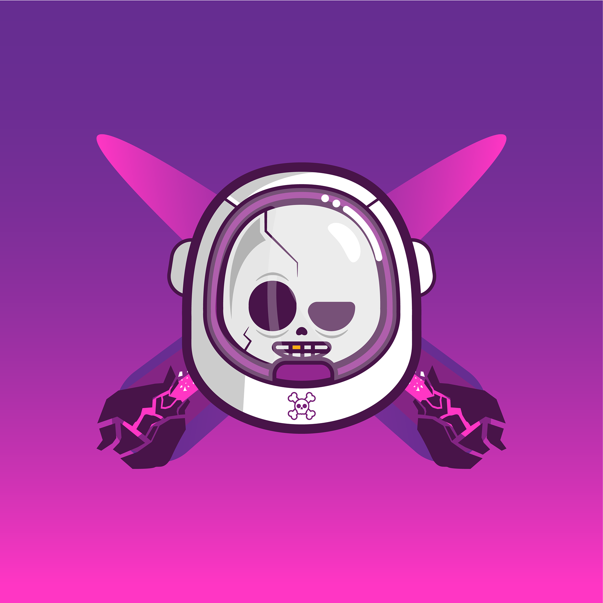
Rebranded Logo Design by me
Execution
The identity system was built through a combination of bold vector illustration, strategic color design, and motion-driven storytelling.
Key execution components included:
Futuristic Pirate Mark: A skull encased in a sleek astronaut helmet, rendered with clean vector strokes, sharp highlights, and geometric balance to ensure impact across mediums.
Crossed Comets: Two diagonal comets replaced traditional crossbones, symbolizing danger, speed, and cosmic exploration. Their trajectory and placement were engineered for both static readability and motion dynamics.
Neon-Space Palette: Hot pink and purple gradients contrasted with white and black to create a vibrant, high-energy visual language that stands out against deep-space settings.
Motion Art Direction: Directed the animation concept, comets streaking in from opposite directions, the logo emerging from deep space, and a final charming wink from the skull to showcase personality.
Cinematic Build: Ensured that timing, easing, and dramatic reveals supported the brand’s adventurous tone and heightened viewer engagement.
The result is a logo designed for movement as much as for stillness, with a personality that translates seamlessly across platforms.
ANIMATED LOGO
Impact
The Space Pirates identity delivers a striking, memorable mark that blends classic pirate symbolism with futuristic energy, creating a fresh narrative in a single visual. The motion sequence amplifies the brand’s attitude, transforming the static logo into a charismatic character with charm and swagger. As a portfolio piece, this project highlights advanced skills in conceptual reinterpretation, vector illustration, color system design, and motion direction. This Space Pirates Logo redesign demonstrates the ability to lead cross-disciplinary collaboration and craft an identity that is both iconic and full of personality, perfect for entertainment, gaming, or sci-fi branding environments.